Idea Behind the branding
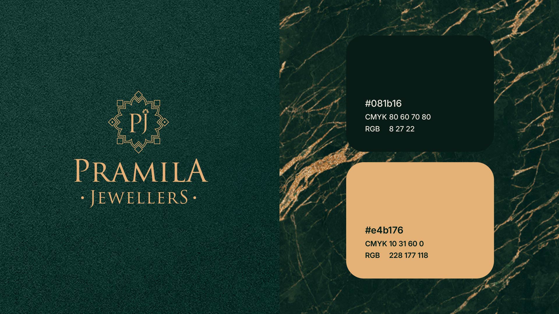
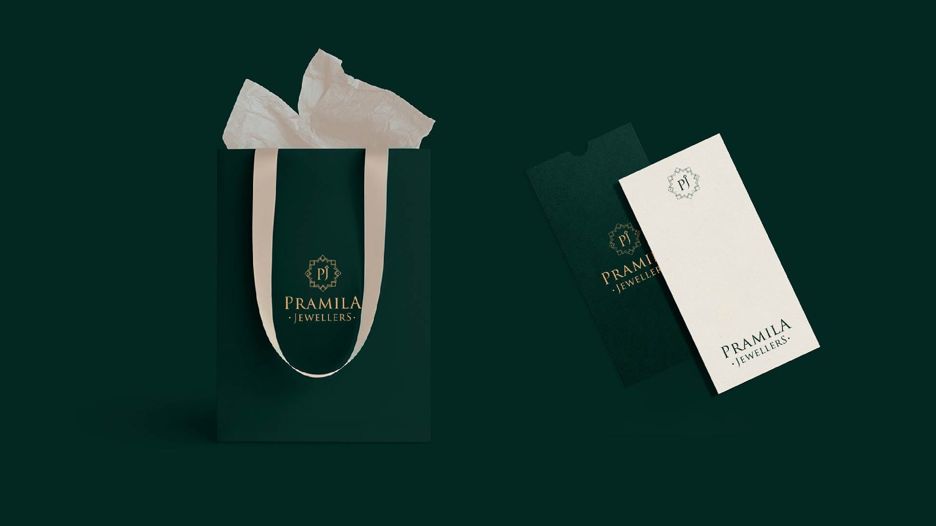
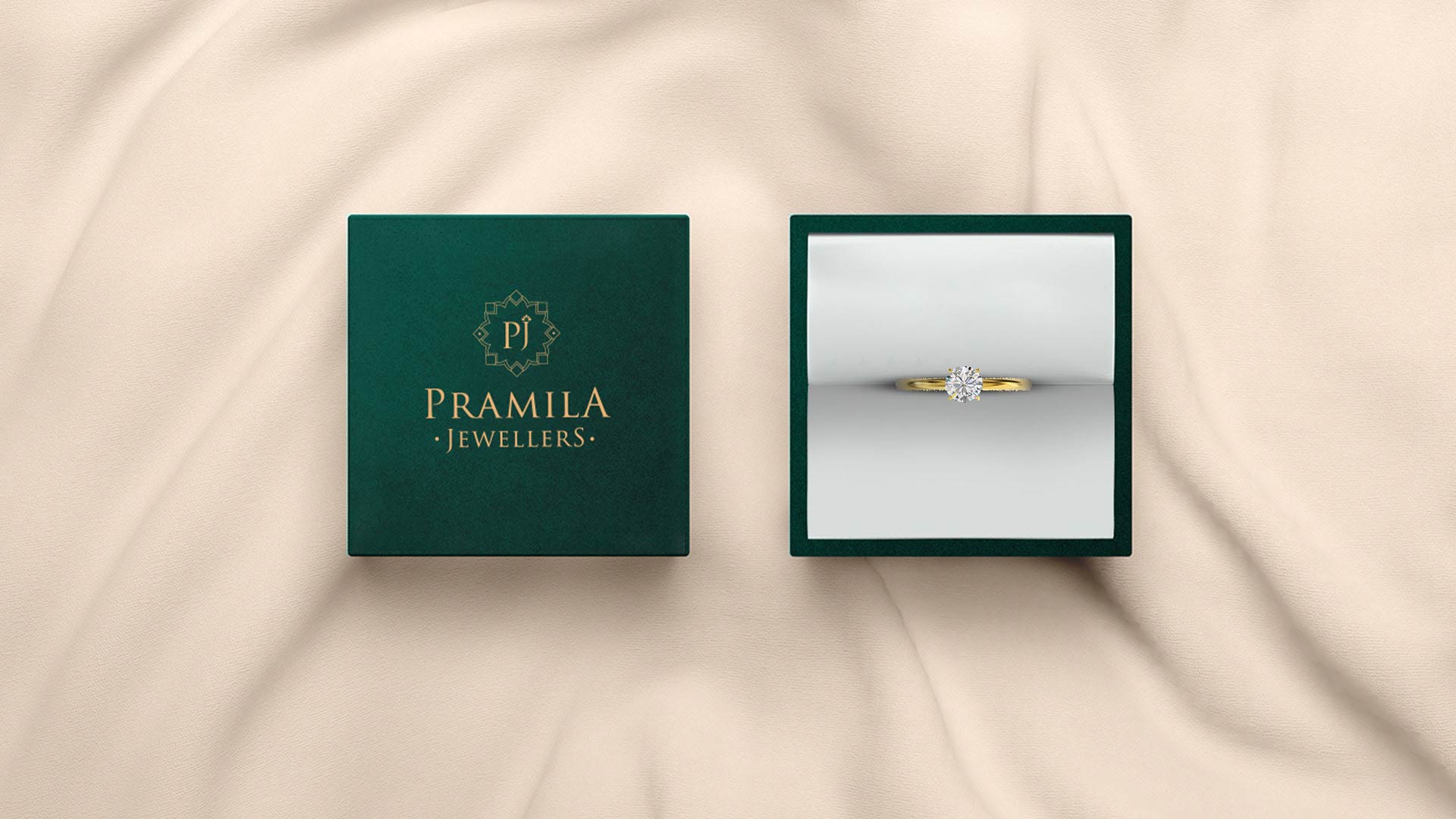
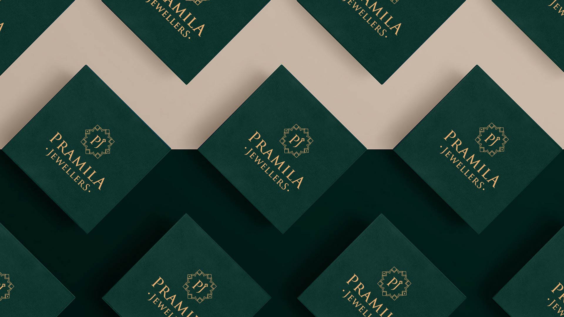
The brand identity for Pramila Jewellers was developed to reflect its premium positioning in the custom gold and diamond jewelry market. Drawing inspiration from the intricate craftsmanship of fine jewelry, the design uses luxurious deep green and gold tones to evoke a sense of elegance and exclusivity. The custom logo pattern was carefully crafted to be both iconic and timeless, embodying the sophistication and attention to detail that the brand stands for. This combination of bold yet refined visuals positions Pramila Jewellers as a premium brand, ensuring it resonates with its target market of discerning, high-end customers.
The Challenge
One of the biggest challenges was selecting a brand identity that would effectively communicate Pramila Jewellers' premium positioning while making it stand out in a crowded luxury market. This included deciding on the right combination of visual elements, colors, and patterns that would reflect the exclusivity and elegance of the brand while also appealing to its target audience of high-end jewelry buyers.
The Solution
To overcome this, we created a rich and luxurious brand identity, using deep green and gold tones that evoke tradition and elegance. The custom geometric logo and intricate pattern were carefully designed to embody the precision and artistry of fine jewelry craftsmanship. This solution successfully delivered a distinctive and memorable visual identity, ensuring Pramila Jewellers stands out in the competitive luxury market, resonating with its target audience.
