Idea Behind the Logo
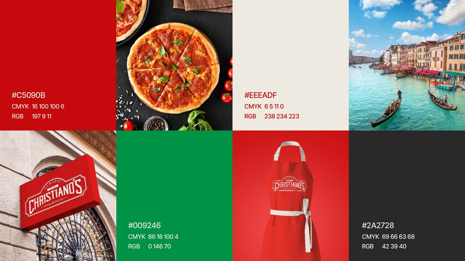
The shape of the logo subtly mirrors the form of a pizza oven, symbolizing the heart of Italian cooking. The bold typography was chosen to emphasize the restaurant's authenticity and prominence in the market, while the color palette is a thoughtful combination of elements: basil green, tomato red, and an off-white hue that balances the design. These colors were selected not only to reflect the Italian flag but also to evoke the natural ingredients used in pizza-making.
The Challenge
Christiano's Pizza & Pasta came with a unique challenge: breaking into the highly competitive Italian food market where pizza is an iconic staple and numerous shops already dominate. The client, a new business, needed a brand that could stand out in a sea of well-established pizzerias. Despite being a newcomer, the client had a strong family tradition of pizza-making, which was a key strength that needed to be conveyed through the brand.
The Solution
We created a bold, authentic brand identity centered around a wood-fired oven-inspired logo, combined with a color palette reflecting fresh ingredients and Italian heritage. This visual narrative highlighted the client’s deep-rooted family tradition while appealing to modern customers, making Christiano's stand out as both authentic and innovative in a crowded market.


